-
Chapter 5: Intro to Controls: Text & ImageRaywenderlich/SwiftUI by Tutorials 2021. 4. 7. 10:49
Version
Swift 5.3, iOS 14, Xcode 12
지금까지 살펴본 내용을 통해 SwiftUI가 UI 개발(development)에 얼마나 놀라운(awesomeness) 수준(level)을 제공하는지 이미 파악(figured out)했을 것이다. 그리고 아마도 앱(apps)에서 UI를 디자인(design)하고 코딩(code)하기 위한 이전(medieval)의 메서드(method)를 어떻게 사용할 수 있었는지 궁금할 것이다. 이 메서드(method)는 원하는 경우 UIKit 또는 AppKit의 이름(name)에 응답(responds)한다.
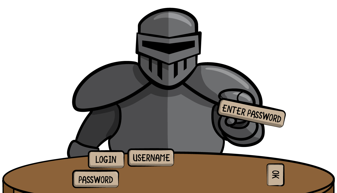
Armored Knights 이전 장(chapters)에서는 SwiftUI의 표면(surface)만 훑어보고(scratched), 몇 가지 기본(basic) UI를 만드는 방법을 배웠다. 추가적으로(additionally), SwiftUI가 제공(offers)하는 것과 이를 사용하여 할 수있는 작업에 대해 학습했다.
이 장(chapter)에서는 UIKit 및 AppKit에서도 사용할 수 있는 UI 개발(development)에서 가장 많이 사용되는(the most-used) 몇 가지 컨트롤(controls)에 대해 자세히 알아보면서 SwiftUI의 대체품(equivalents)에 대해 더 배운다.
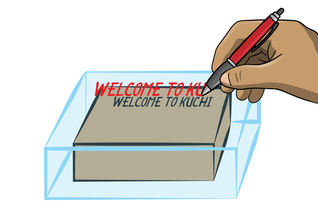
이를 위해 언어 플래시 카드 앱(language flashcard app)인 Kuchi를 작업하면서 다음 5개 장(chapters)을 계속 진행할 것이다.
Getting started
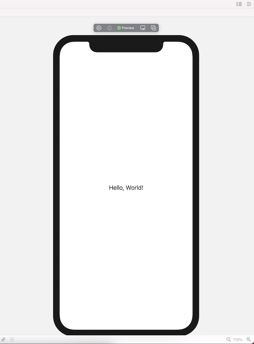
먼저 이 장(chapter)의 시작(starter) 프로젝트(project)를 열면 거의 비어(empty) 있는 것을 알 수 있다. 사용자 인터페이스(user interface)가 거의 없고, 일부 리소스(resources)와 지원(support) 파일(files)만 있다. 빌드(build)하고 실행(run)하면 빈(blank) 뷰(view)만 표시된다.
Project Navigator에서 Welcome 그룹(group)을 찾아 마우스 오른쪽 버튼으로 클릭(right-click)한 다음 New File을 선택(choose)한다.
다음 팝업(popup)에서 SwiftUI View를 선택한 다음, Next를 클릭(click)한다.
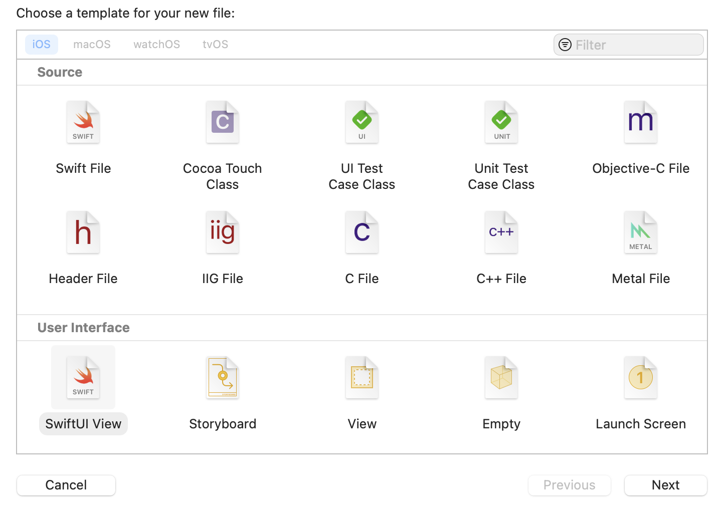
Select SwiftUI View 그런 다음, Save As 필드(field)에 WelcomeView.swift를 입력하고, iOS 및 macOS 대상(targets)이 모두 선택(selected)되었는지 확인(ensure)한 다음, Create를 클릭(click)한다. 이제 비어있는(blank) 새 뷰(view)로 시작할 수 있다.
Changing the root view
작업을 수행하기 전에 새
WelcomeView를 시작 뷰(starting view)로 사용하도록 앱(app)을 구성(configure)해야 한다. KuchiApp.swift를 열고WindowGroup내부(inside)에EmptyView를 포함(contains)하는body속성(property)을 찾는다.var body: some Scene { WindowGroup { EmptyView() } }이 코드는 앱(app)이 시작(launched)될 때 생성되고 표시(displayed)되는 뷰(view)를 결정한다. 현재 생성된 뷰(view)는
EmptyView로, 빈(empty) 뷰(view)이다. 이는 가능한 가장 간단한(the simplest) 뷰(view)이다. 방금 생성한 새 뷰(view)인WelcomeView의 인스턴스(instance)로 교체(replace)한다:WindowGroup { WelcomeView() }이제 앱(app)이 시작되면
WelcomeView가 첫 번째 뷰(view)가 될 것이다. 그리고(while you’re on it) 미리보기(preview)에서EmptyView를 바꿔야(replace)한다. 현재는 다음과 같다:struct KuchiApp_Previews: PreviewProvider { static var previews: some View { EmptyView() } }교체(replacement) 후에 다음과 같아야 한다:
struct KuchiApp_Previews: PreviewProvider {
  static var previews: some View {
    WelcomeView()
  }
}
WelcomeView!
이제 새로 생성된 뷰(view)를 살펴본다. WelcomeView를 열면 별게 없다는 것을 알 수 있다(notice):
body속성(property)과Text구성 요소(component)를 포함(containing)하는WelcomeView구조체(struct)WelcomeView_Previews라는 미리보기 제공자(preview provider)
하지만 이것이 시작하는 데 필요한 전부이다.
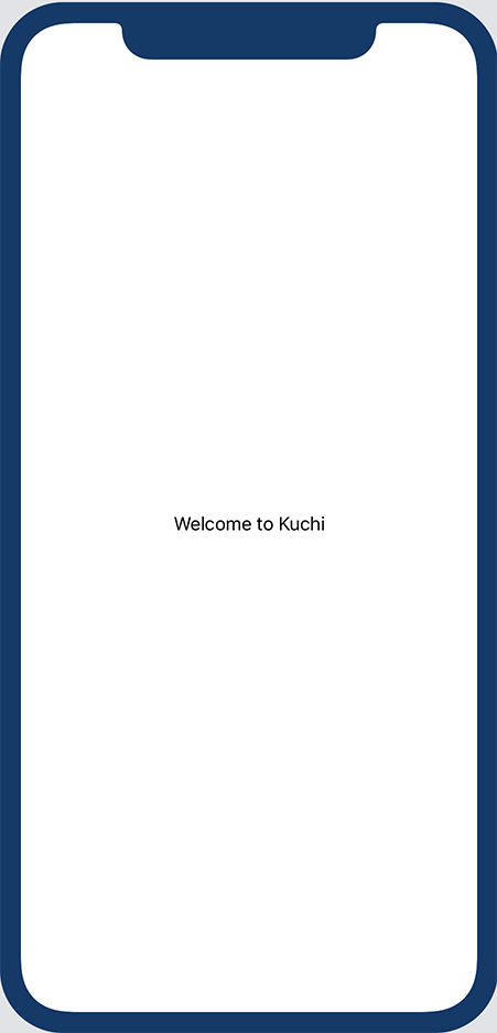
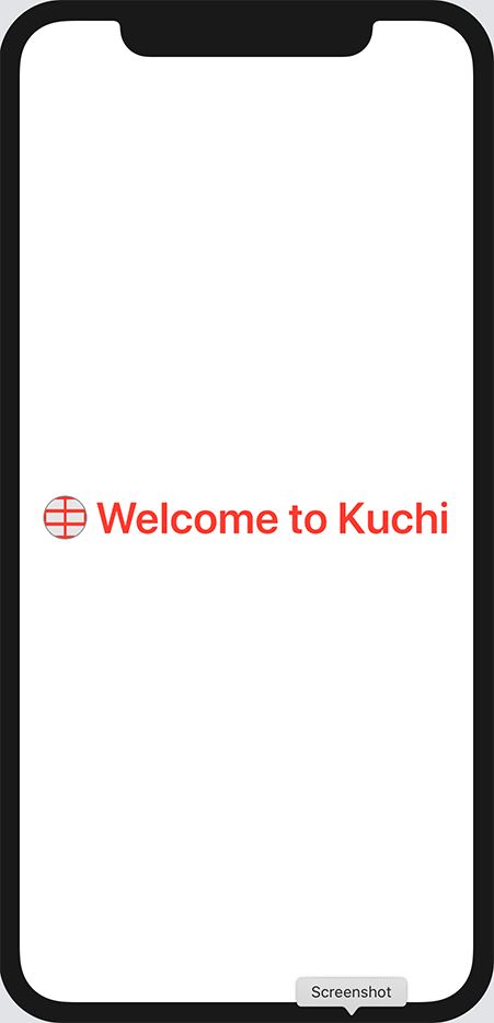
body는 뷰(view)의 유일한(only) 필수 요소(requires)이다. 훌륭하고(great) 세련된(stylish) UI를 구현(implementing)하는 것은 개발자의 일이다.Xcode에서 캔버스(canvas)가 assistant 패널(panel)에 표시되는지 확인(ensure)하고, 필요한 경우 Resume 버튼(button)을 클릭(click)하여 미리보기(preview)를 활성화(activate)하거나 재활성화(reactivate)한다. 다음과 같은 환영(welcome) 메시지(message)가 표시되어야 한다:
Hello World image Text
입력(Input)에는 컨텍스트(context)가 필요(requires)하다. 목적(purpose)을 알 수(indication) 없는 빈(blank) 텍스트 입력 필드(text input field)가 표시되면, 사용자는 여기에 무엇을 입력(put)해야 할지 알 수 없다. 그렇기 때문에 컨텍스트(context)를 제공(provides)하는 텍스트(text)가 중요(important)하다. 이전(previous)의 UIKit 또는 AppKit 기반 앱(apps)에서 수 많은
UILabel을 사용해 봤을 것이다.이미 살펴본 것처럼(as you've already seen), 텍스트(text)를 표시(display)하는 구성 요소(component)를 간단히
Text라고 한다. 가장 간단하고(simplest) 일반적으로(commonly) 사용되는 생성자(initializer)에서Text는 표시할 텍스트(text)를 나타내는(display) 단일(single) 매개 변수(parameter)를 사용한다. 문자열(string)을Welcome to Kuchi로 변경(change)한다:Text("Welcome to Kuchi")Xcode는 미리보기(preview)에 표시된 텍스트(text)를 자동으로(automatically) 업데이트(update)한다. 지금까지 간단(simple)한 작업(stuff) 이었지만, 모든 긴 여정은 항상 한 걸음으로 시작한다(every long journey always starts with a single step).
Welcome Kuchi Modifiers
이제 화면(screen)에 텍스트(text)를 표시(displayed)했으므로, 다음의 자연스러운(natural) 단계(step)는 모양(appearance)을 변경(change)하는 것이다. 크기(size), 두께(weight), 색상(color), 기울임꼴(italic) 등과 같은 다양한 옵션(plenty of options)을 사용하여 텍스트(text)가 화면(screen)에 표시되는 방식을 수정(modify)할 수 있다.
Note: 이전(previous) 장(chapters)에서 수정자(modifier)를 사용하여 뷰(view)의 모양(look)이나 동작(behavior)을 변경(change)하는 방법을 이미 배웠다. 수정자(modifier)는 뷰(view)의 복사본(copy)을 만들어 작업(글꼴 크기(font size), 색상(color) 변경 등)을 수행하고 수정된(modified) 뷰(view)를 반환(returns)하는 뷰(view)의 인스턴스(instance) 메서드(method)이다.
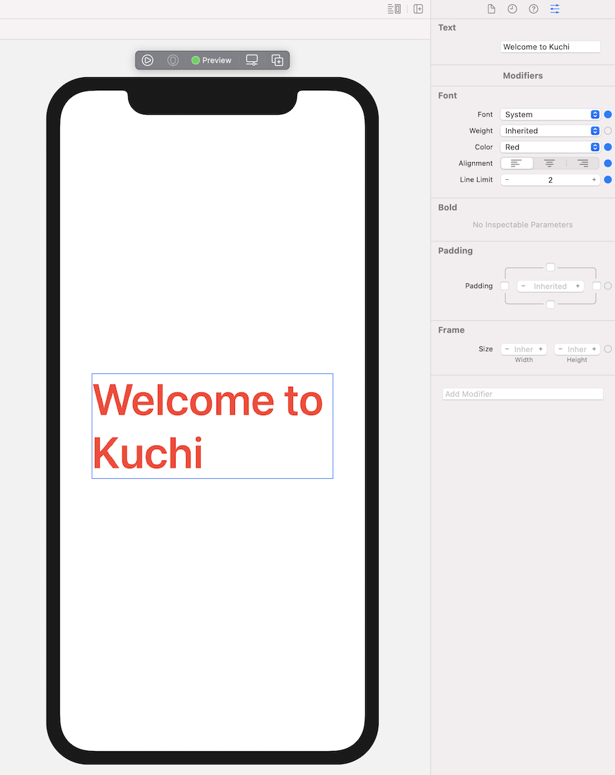
Kuchi Package Text인스턴스(instance)의 모양(look)을 변경(change)하려면 수정자(modifiers)를 사용한다. 그러나 그보다 더 일반적으로, 모든 뷰(view)는 수정자(modifiers)를 사용하여 변경(altered)할 수 있다.텍스트(text)를 60 포인트(points)로 키우려면, 다음과 같이
font수정자(modifier)를 추가한다:Text("Welcome to Kuchi") .font(.system(size: 60))그런 다음 텍스트(text)를 굵게(bold) 표시한다:
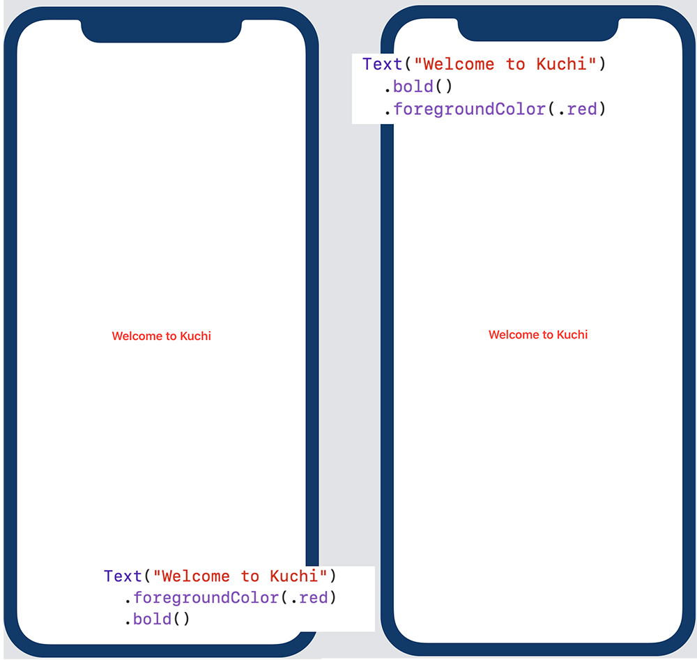
Text("Welcome to Kuchi") .font(.system(size: 60)) .bold()또, 멋진 빨간색으로 만들 수 있다:
Text("Welcome to Kuchi") .font(.system(size: 60)) .bold() .foregroundColor(.red)다음으로 텍스트(text)를 두 줄(lines)로 나눌(split) 수 있다:
Text("Welcome to Kuchi") .font(.system(size: 60)) .bold() .foregroundColor(.red) .lineLimit(2)마지막으로(finally), 텍스트(text)를 왼쪽 정렬(left-align)할 수 있다:
Text("Welcome to Kuchi") .font(.system(size: 60)) .bold() .foregroundColor(.red) .lineLimit(2) .multilineTextAlignment(.leading)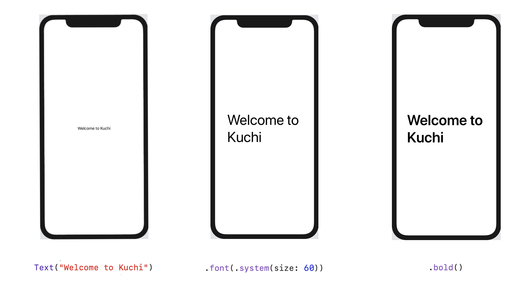
Kuchi Steps 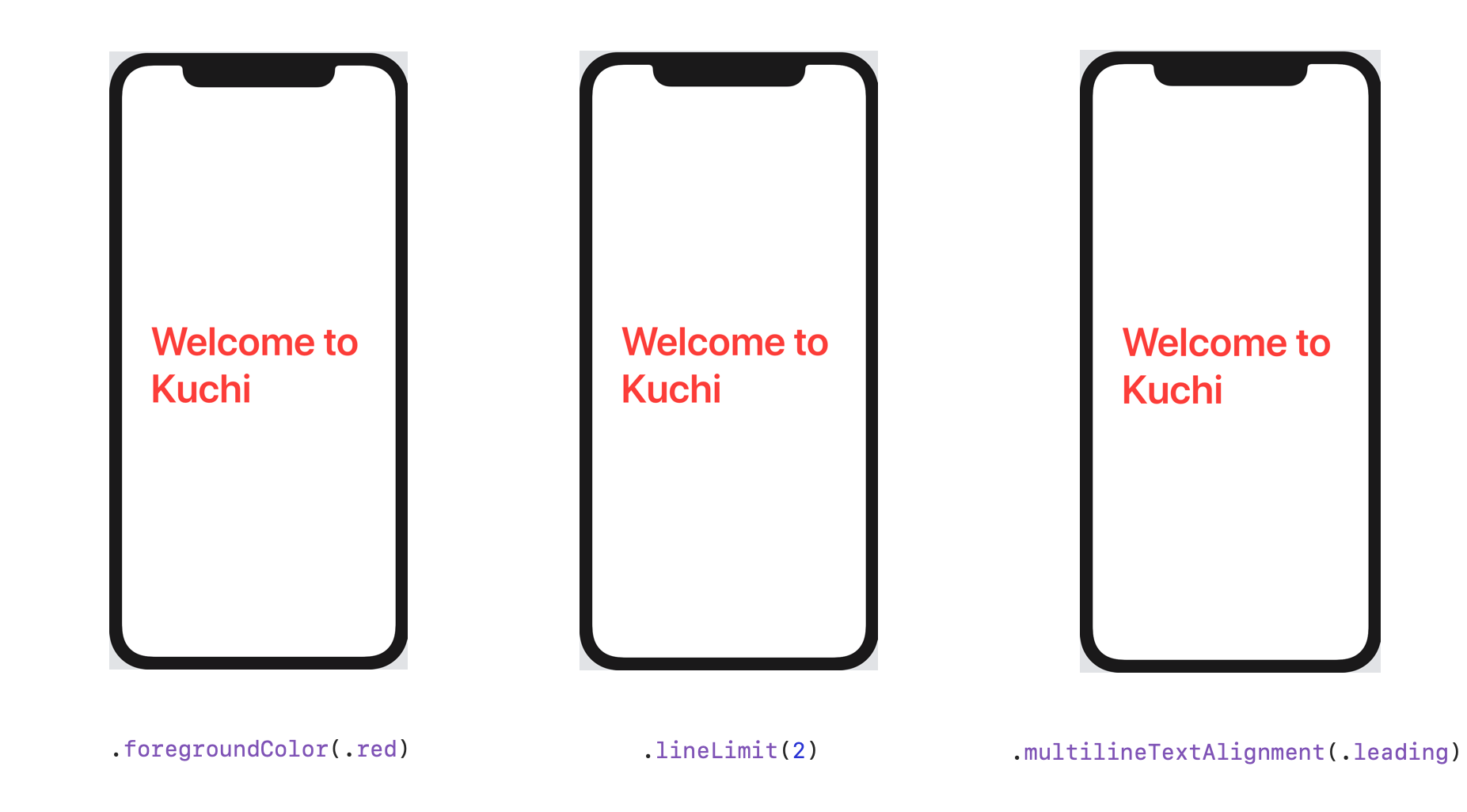
Kuchi Steps 2 마지막 두 단계(steps)에서 명확한(obvious) 결과가 나오지(produced) 않는다는 것을 눈치챘을(noticed) 것이다. 실제로
.lineLimit의 기본값(default value)은nil(제한 없음)이고,multilineTextAlignment의 기본값(default)은.leading이다.이 UI 구성 요소(component)의 기본값(default values)이 변경(change)되지 않는다고 가정(assume)하는 것이 안전(safe)하지만, SwiftUI 베타 릴리스 단계(beta release phases)에서 개발자들이 언급(noted)했듯이 향후 변경(change)될 수 있다. 또한(moreover)
.lineLimit의 경우 화면 공간(screen real estate)을 보존(preserve)하기 위해 값을 최대(maximum)2로 제한(restrict)할 수 있다.지금까지 수정자(modifiers)를 추가(add)하고 구성(configure)하는 데에 코드만(exclusively) 사용했지만, SwiftUI는 Xcode를 함께(tandem) 사용하는 두 가지 대안(alternatives)을 제공한다:
- 캔버스(canvas)에서 뷰(view) 구성 요소(component)를 Command-click하면 팝업(popup) canvas inspector가 나타난다:
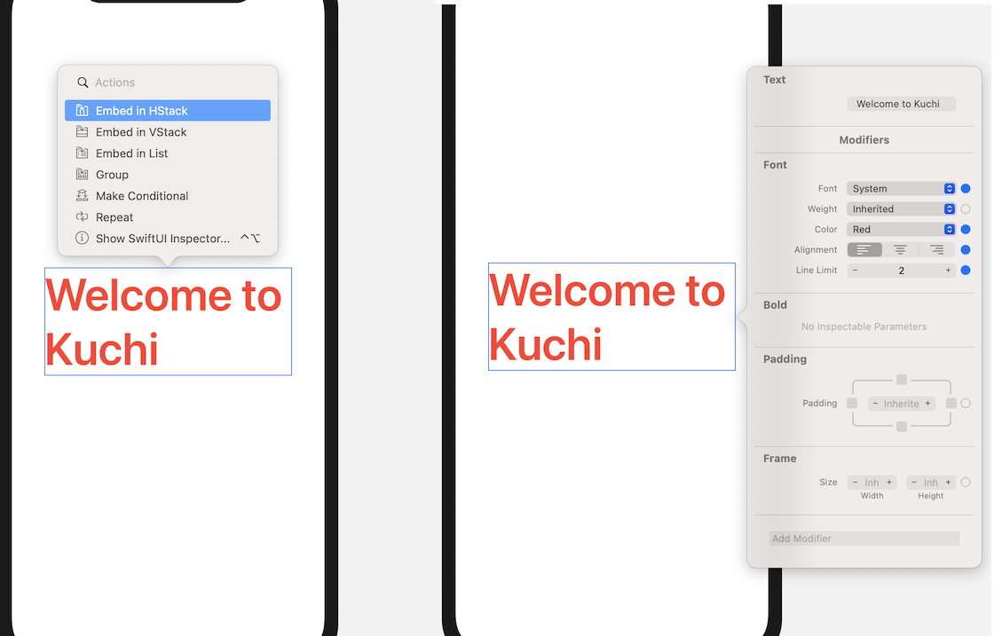
Canvas modifiers - Option-Command-4를 누르면 나타나는 attributes inspector는 캔버스(canvas)에서 현재(currently) 선택된(selected) 뷰(view)에 대한 수정자(modifiers)를 표시(displays)한다:
Inspector modifiers Text는 매우 간단한(simple) 구성 요소(component)이지만, 수정자(modifiers)가 매우 많다. 그리고 그것은 시작에 불과하다. SwiftUI가 제공(offers)하는 수정자(modifiers)에는 두 가지 범주(categories)가 있다:View프로토콜(protocol)과 함께 번들(bundled)로 제공되어, 모든 뷰(view)에서 사용할(available) 수 있는 수정자(modifiers)- 유형(type)에 특정(specific)되며 해당 유형(type)의 인스턴스(instances)에서만 사용할(available) 수 있는 수정자(modifiers)
View에는 프로토콜(protocol) 확장(extensions)에서 구현(implemented)된 사전 제작(premade)되어 바로 사용(ready-to-use)할 수 있는 수정자(modifiers)가 많이 있다. 전체 목록(list)을 보려면 문서(documentation)를 찾아(browse) 볼 수 있다. Xcode의 소스 편집기(source editor)에서View를 Option-click한 다음 Open in Developer Documentation를 클릭(click)한다.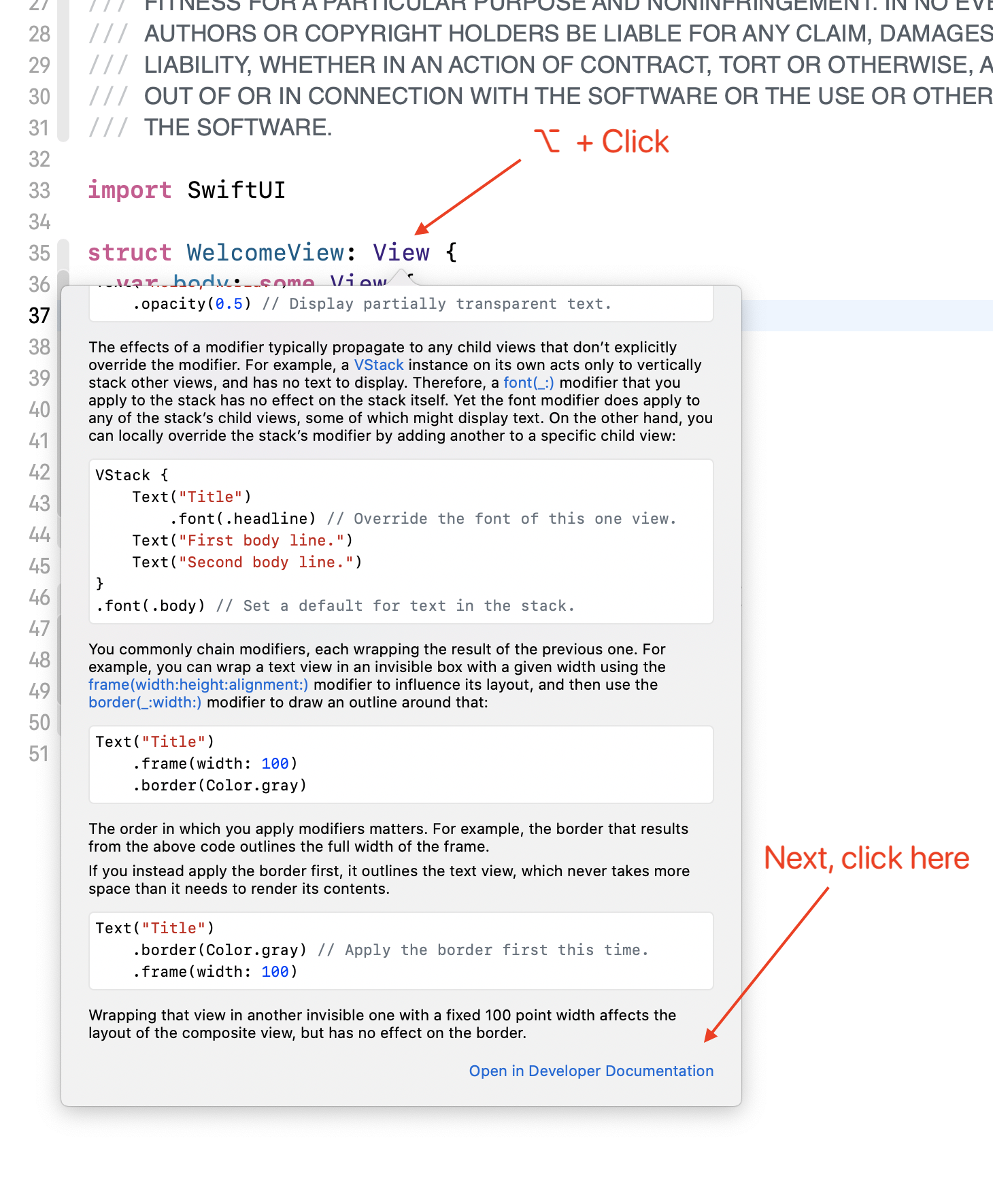
XCode documentation 문서(documentation)를 찾아 보는 것은 학습할 때 항상 도움이 되지만, 때로는 수정자(modifier)를 검색(search)하는 더 빠른(faster) 방법이 필요할 때도 있다. 수정자(modifier)의 이름을 기억(remember)하지 못하거나, 단순히 그러한 수정자(modifier)가 있는지(exists) 궁금(wondering)할 수 있다.
Xcode와 SwiftUI가 이를 도와 줄 수 있다. 3장(chapter): Diving Deeper into SwiftUI을 기억(remember)할 수 있듯이, Xcode에는 이전 버전(older versions)의 Xcode에서 사용할 수 있는 Object Library와 유사한 Modifiers Library가 있다.
라이브러리(library)에 접근(access)하려면 Xcode 창(window)의 오른쪽 상단 모서리(top-right corner)의 가장 왼쪽(leftmost)에 있는 + 버튼(button)을 클릭(click)한다. 라이브러리(library)를 사용하여 이름으로 찾아보고(search by name) 검색(browse)할 수 있으며, 가장 중요한 것은 모든 수정자(modifiers)를 범주(category)별로 분류(groups)하고 있기 때문에 실제로 존재(exists)하는 경우 원하는 내용을 빠르게 찾을(looking for) 수 있다.
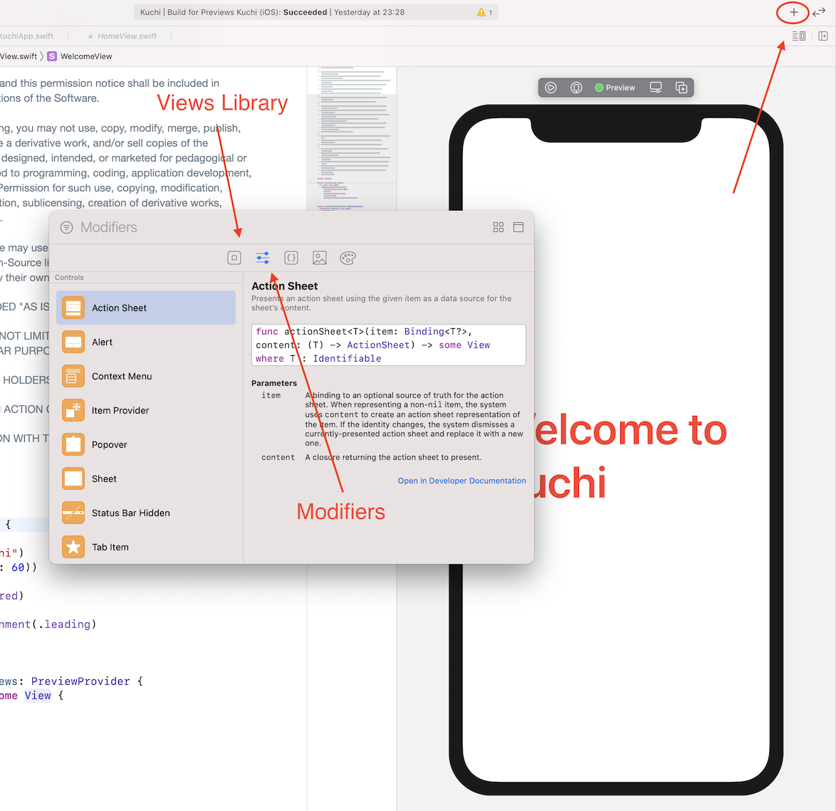
Views and modifiers libraries 또한, 라이브러리(library)에는 양방향 사용자 인터페이스 개발(two-way user interface development)을 위해 뷰(views)를 찾아보고(browse) 선택하여(select) 캔버스(canvas)로 끌어오는(drag) 데 사용할 수 있는 뷰 라이브러리(Views Library)도 포함(contains)되어 있다.
Are modifiers efficient?
모든 수정자(modifier)는 새로운 뷰(view)를 반환(returns)하기 때문에, 이 과정(process)이 실제로 일을 처리하는 가장 효율적인(efficient) 방법인지 궁금(wondering)해 할지도 모른다. SwiftUI는 수정자(modifier)를 호출(invoke)할 때마다 해당 뷰(view)를 새로운 뷰(view)에 포함(embeds)한다. 이는 뷰 스택(stack of views)을 생성(generates)하는 재귀적인(recursive) 과정(process)이다. 가상의 마트료시카(Matryoshka) 인형 세트로 생각할 수 있는데, 다른 모든 것에 묻혀(buried)있는 가장 작은 뷰(smallest view)가 수정자(modifier)가 호출(called)된 첫 번째 뷰(view)이다.
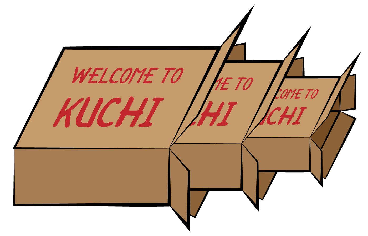
Russian Dolls 직관적으로(intuitively) 이는 자원 낭비(waste of resources)처럼 보인다. 사실은 SwiftUI가 이 스택(stack)을 뷰(view)의 실제(actual) 렌더링(rendering)에 사용되는 효율적인(efficient) 데이터 구조(structure)로 평면화(flattens)한다.
뷰(view)의 효율성(efficiency)에 영향을 미칠(impacting) 염려(fear)없이, 필요한 만큼의 수정자(modifiers)를 자유롭게(feel free) 사용할 수 있어야 한다.
Order of modifiers
수정자(modifiers)를 호출(invoke)하는 순서(order)는 중요(important)하다. 하지만 적어도(at least)시각적인(visual) 관점(perspective)에서는, 많은 경우에 "중요하지 않다".
예를 들어(for example), bold 수정자(modifier)를 적용(apply)한 다음 글자를 빨간색으로 만드는 경우:
Text("Welcome to Kuchi")
    .bold()
    .foregroundColor(.red)
.. 또는 먼저 빨간색으로 만든 다음 굵게(bold) 하는 경우:
Text("Welcome to Kuchi")
    .foregroundColor(.red)
    .bold()
어떤 차이(difference)도 눈치채지(notice) 못할 것이다.
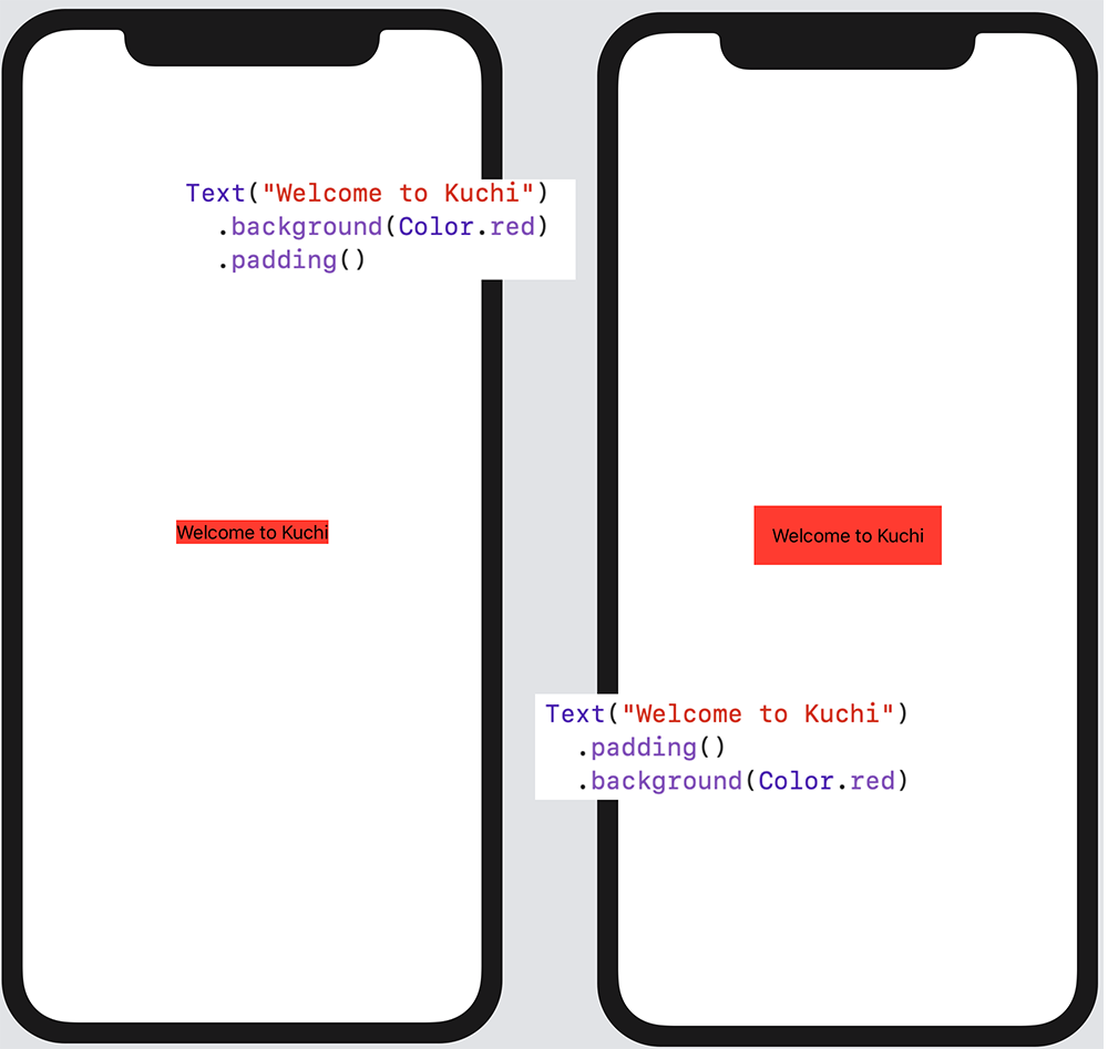
Modifiers 그러나 배경색(background color)을 적용(apply)한 다음 패딩(padding)을 적용하면 다른(different) 결과가 나타난다.
.padding은 수정자(modifier)가 적용된 뷰(view)와 해당 뷰(view)의 상위(parent) 뷰(view) 사이에 간격(spacing)을 추가(adds)하는 수정자(modifier)이다. 매개 변수(parameters)가 없으면 SwiftUI는 네 방향(directions) 모두에 기본(default) 패딩(padding)을 추가하지만, 해당 패딩(padding)을 직접 구성(configure)할 수도 있다.아래의 구성(configuration)을 고려(consider)해 본다:
Text("Welcome to Kuchi")
  .background(Color.red)
  .padding()
텍스트에 빨간 배경색(background color)을 추가(add)한 다음 패딩(padding)을 적용(apply)한다. 하지만 그 순서(order)를 반대로(invert) 하면 다음과 같다:
Text("Welcome to Kuchi")
  .padding()
  .background(Color.red)
패딩(padding)을 먼저 적용(apply)하여 더 큰 뷰(view)를 만든 다음, 빨간 배경(background)을 적용(apply)한다. 결과가 다른(different) 것을 즉시(immediately) 알 수(notice) 있다:
Modifiers background 이는 배경색(background color)을 적용(apply)한 뷰(view)가 경우마다 다르기 때문이다. 이를 확인하는 또 다른 방법은 뷰(view)에 패딩(padding)을 다르게 적용(apply)하는 것이다.
패딩(padding)을 적용(applying)하기 전후로 다른 배경색(background colors)을 설정(set)하면 명확하게(clearly) 볼(visible) 수 있다:
Text("Welcome to Kuchi")
  .background(Color.yellow)
  .padding()
  .background(Color.red)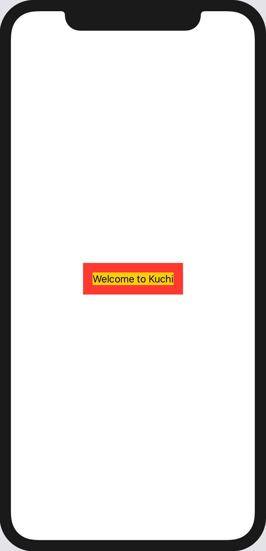
Modifiers color padding 패딩(padding)은 텍스트(text)와 뷰(view)의 가장자리(edges) 사이에 약간의 공간(space)을 추가(adds)한다. 패딩(padding) 전에 배경색(background color)을 적용(apply)하면, 해당 수정 사항(modification)이 텍스트(text)가 포함(contains)된 뷰(view)에 적용(applied to)되며, 이 뷰(view)는 표시된 텍스트(text)를 포함(contain)할 정도의 크기를 가진 뷰(view)이다.
padding수정자(modifier)는 두 번째 배경색(background color)이 적용(applied to)되는 새 뷰(view)를 추가한다.Image
백문이 불여일견이다(an image is worth a thousand words). 진부한 표현(clich)일 수 있지만, UI에 관해서는 절대적으로(absolutely) 사실이다. 이 섹션(section)에서는 UI에 이미지(image)를 추가(add)하는 방법을 보여준다.
먼저
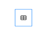
body에서 welcomeText를 제거(remove)하고, 아래와 같이Image구성 요소(component)로 바꾼다(replace):var body: some View { Image(systemName: "table") }화면(screen)에 표시되는 내용은 다음과 같다:
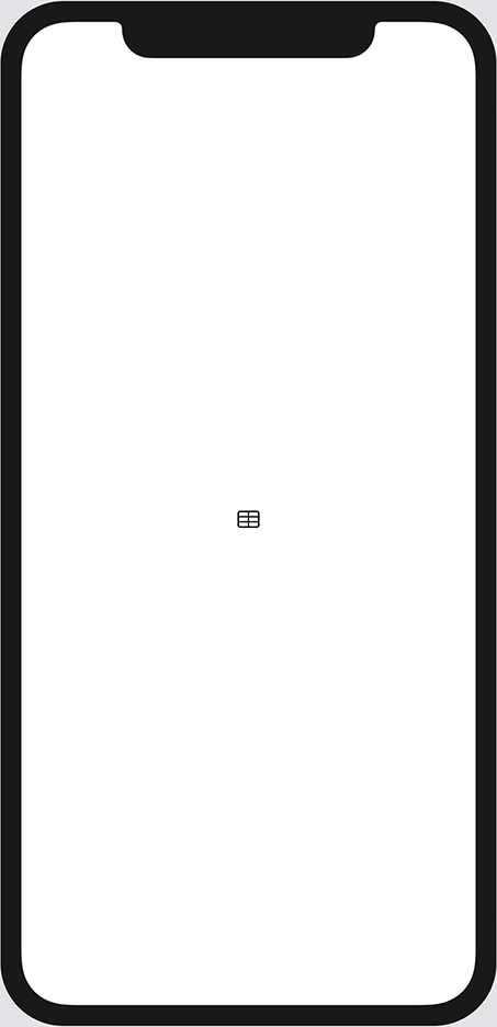
image-raw Changing the image size
수정자(modifiers)를 제공하지 않고 이미지(image)를 만들면, SwiftUI는 이미지(image)를 기본 해상도(native resolution)로 렌더링(render)하고 가로 세로 비율(aspect ratio)을 유지(maintain)한다. 여기에서 사용하고 있는 이미지(image)는 2019년 Apple이 iOS, watchOS, tvOS의 새(iterations) 버전에서 도입한(introduced) 아이콘(icons) 세트인 SF Symbols에서 가져온 것이다. 이전 장(previous chapters)에서 이미 사용하였다. 자세한 내용은 이 장(chapter)의 끝에 있는 링크(links)를 확인(check out)한다.
이미지(image) 크기를 조정(resize)하려면,
resizable수정자(modifier)를 적용(apply)해야 한다. 이 수정자는 inset과 resizing mode라는 두 개의 매개 변수(parameters)를 사용합니다. resizing mode는.tile또는.stretch일 수 있다.매개 변수(parameters)를 제공(provide)하지 않으면, SwiftUI는 네 방향(top, bottom, leading, trailing) 모두에 inset을 주지 않고
.stretchresizing mode를 적용한다.Note:
resizable수정자(modifier)를 적용(apply)하지 않으면, 이미지(image)는 기본 크기(native size)를 유지(keep)한다. 이미지 크기(size)를 직접(directly) 또는 간접적(indirectly)으로 변경(changes)하는 수정자(modifier)를 적용하면 해당 변경 사항이 실제 뷰(view)에 적용(applied to)되지만, 이미지(image) 자체에는 적용되지 않고 원래 크기(original size)가 유지(retain)된다.따라서 백문이 불여일견(images are worth a thousand words)이라면, 코드 예제(examples)는 천 개 이미지(images)의 가치가 있어야 한다. 너비(wide)와 높이(high)가 30 포인트(points)인 정사각형(square) 프레임(frame)에 이미지(image)를 포함(embed)하려면, 해당 이미지(image)에
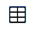
frame수정자(modifier)를 추가하기만 하면 된다:var body: some View { Image(systemName: "table") .frame(width: 30, height: 30) }미리보기(preview)에는 아무런 차이가 없을 것이다. 이미지(image)는 여전히(still) 원래 크기(riginal size)로 표시된다. 그러나 이미지를 클릭(click)하여 선택(select)하면, Xcode는 선택 강조 표시(selection highlight)를 파란색 테두리(border)로 표시한다:
non-resizable 가장 바깥 쪽(outermost) 뷰(view)의 크기(size)는 정확(correct)하지만, 예상대로(expected) 이미지(image) 크기(scale)가 일치(match)하지 않는다.
이제 크기
resizable수정자(modifier)를frame앞에(prepend) 추가한다:var body: some View { Image(systemName: "table") .resizable() .frame(width: 30, height: 30) }출력(output)은 이전보다 예상한(expected) 것에 훨씬 더 가까워진다:
resizable-image Note: 이미지(image)에 포인트(points) 단위로 측정(measured in)되는 절대 크기(absolute size)를 지정했다. 그러나 접근성(accessibility)을 위해, 그리고 앱(app)이 다양한 해상도(resolutions), 방향(orientations), 기기(devices), 플랫폼(platforms)에 맞출(adapt to) 수 있도록 항상 SwiftUI가 이미지(images), 보다 일반적으로는(generally) 대부분의 UI 콘텐츠(content)를 조정하도록 하는 것이 좋다. 이 장(chapter)에서는 이에 대해 간략히(briefly) 설명하지만, 다음 장(chapter)에서 보다 심층적으로(in-depth) 살펴볼 것이다.
해당 이미지를 변형(transform)하고 조작(manipulate)하여 밝은 회색(light gray) 배경(background)에 테두리(bordered)가 있는 원형(circular) 빨간색 격자(red-colored grid)처럼 보이게 하려면
.frame뒤에 다음 코드를 추가한다:.cornerRadius(30 / 2) //모서리(corner)의 반경(반지름, radius)을 이미지 크기의 절반으로 설정한다. .overlay(Circle().stroke(Color.gray, lineWidth: 1)) //얇은 회색 테투리를 추가한다. .background(Color(white: 0.9)) //밝은 회색 배경색을 추가한다. .clipShape(Circle()) //원 모양으로 과도한 배경을 제거한다. .foregroundColor(.red) //전경색을 빨간색으로 설정한다.수정자(modifiers) 시퀀스(sequence)가 각 단계(step)에서 결과 이미지(resulting image)에 미치는 영향은 다음과 같다:
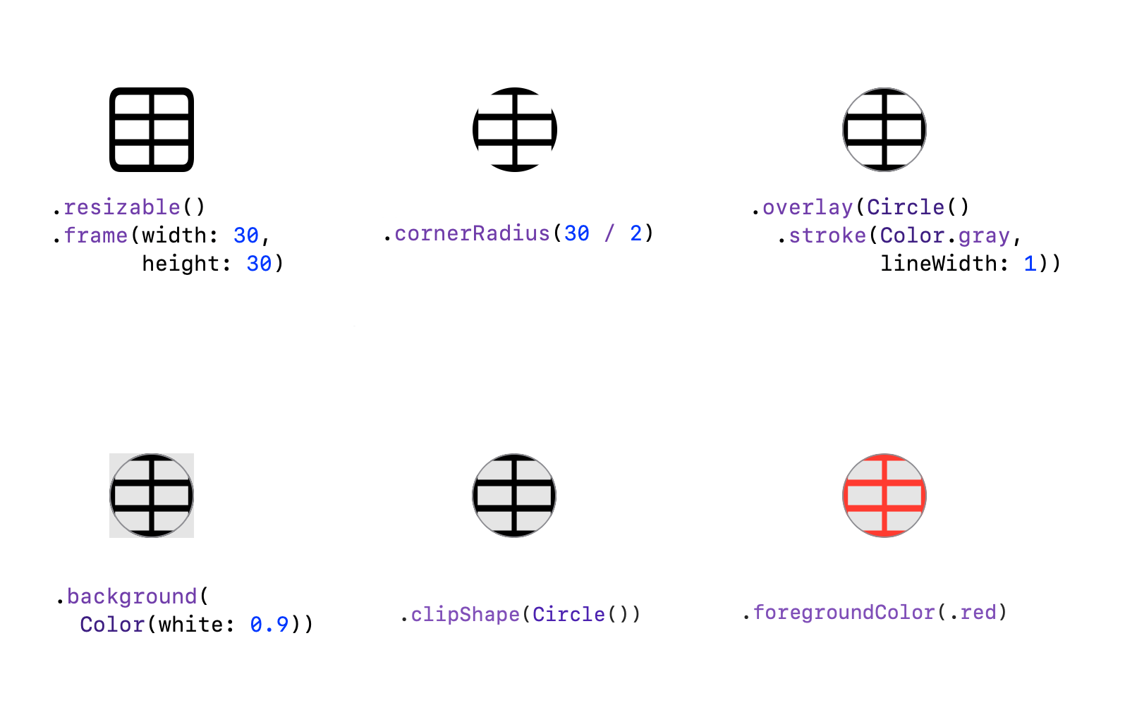
Image modifiers stack 이전 코드의 수정자(modifiers) 중 하나가 중복(redundant)되고 있다. 해당 수정자(modifier)를 제거(remove)해도 결과 이미지(resulting image)는 동일하다.
언뜻 보기에(at first glance) 명확(obvious)하지 않을 수 있지만, 이미지를 둥글게(circular) 만드는 모서리 반경(corner radius)은 실제로 이미지(image)를 잘라(clips)낸다. 그런데 위 코드의 4번째 행(line)인 clipShape에서 같은 작업을 하고 있다. 실제로 cornerRadius 수정자(modifier)를 삭제(delete)하거나 주석 처리(comment out)해도 결과 이미지(resulting image)가 변경되지 않는 것을 볼 수 있다.
이제 해당 코드 행(line)을 안전하게(safely) 제거(remove)한다.
이 섹션(section)에서 배운 단 몇 줄의 코드(a few lines of code)로 이미지(image)를 조작(manipulate)하고 변환(transform)하는 것이 얼마나 쉬운지 생각해(considered) 보기 바란다. 동일한 결과를 얻기(achieve) 위해 UIKit 또는 AppKit에서는 훨씬 더 많은(quite a lot more) 코드를 작성 해야 했다.
Brief overview of stack views
다음 주제(topic)로 넘어가기 전에, 이전(previous) 섹션(section)에서 Image 작업 중 제거한(removed) 코드를 복구(recover)해야 한다.
Text 뷰(view)를 다시 추가(add)하려면 body의 구현(implementation)을 다음과 같이 변경(alter)한다. 여기에서는 Text의 글꼴 크기(font size)가 60에서 30으로 줄었다. 그렇지 않으면 이미지(image)에 비해(compared to) 너무 크게 보일 것이다.
Image(systemName: "table")
  .resizable()
  .frame(width: 30, height: 30)
  .overlay(Circle().stroke(Color.gray, lineWidth: 1))
  .background(Color(white: 0.9))
  .clipShape(Circle())
  .foregroundColor(.red)

Text("Welcome to Kuchi")
  .font(.system(size: 30))
  .bold()
  .foregroundColor(.red)
  .lineLimit(2)
  .multilineTextAlignment(.leading)
이것은 뷰(view)에 여러(multiple) 하위 뷰(subviews)를 추가하는 올바른 방법(correct way)이 아니다. 일부 예외(exceptions)를 제외하면,
View의body속성(property)에는 하나의 하위 뷰(subview)만 있어야 한다(expects).SwiftUI 1.0에서 위(above)의 코드는 컴파일 오류(compilation error)가 발생(caused)했지만, 이제는 컴파일(compiles)되고 작동(works)한다. 모든 하위 뷰(subviews)가 수직으로 쌓인다(stacked vertically). 그러나(however) Xcode에서 미리보면(preview) 하위 뷰(subview)당 하나의 미리보기(preview)가 표시된다.
뷰(view)에 둘 이상의 하위 뷰(subview)를 포함(embed)하려면 컨테이너 뷰(container view)를 사용(rely on)해야 한다. 가장 간단하고(simplest) 일반적으로(commonly) 사용되는 컨테이너 뷰(container views)는 UIKit의
UIStackView에 대응(counterpart)하는 SwiftUI의 스택(stack)이다.스택(stacks)은 가로(horizontal), 세로(vertical), 더 나은 용어가 없기 때문에(lack of a better term) 다른 것의 위에 위치(on top of one another)하는 서로 다른 3가지 종류(flavors)로 제공된다. 지금은 UIKit의
UIStackView에 상응(counterpart)하는 SwiftUI인 가로 버전(horizontal version)을 사용한다. 두 가지 뷰(views)를HStack에 포함(embed)한다:HStack { Image(systemName: "table") ... Text("Welcome to Kuchi") ... }Note: 7장(chapter), "Introducing Stacks & Containers"에서
HStack에 대해 알아본다. 지금 당장 알아야 할 것은HStack이 수평(horizontal) 레이아웃(layout)으로 여러(multiple) 뷰(views)를 그룹화(group)할 수 있는 컨테이너 뷰(container view)라는 것이다.Xcode 미리보기(preview)에서 뷰(view)가 다음과 같이 보인다:
First hstack More on Image
두 섹션(sections) 전에
Image뷰(view)를 사용한 과정(process) 끝(end)에 아이콘(icon)을 만들었다. 이 섹션(section)에서는 다시Image를 사용하여, 시작 화면(welcome screen)에 표시(display)할 배경 이미지(background image)를 만든다.이를 위해 종이(sheets of papers)를 계속 위로 겹쳐 쌓는 것(stack)처럼, 뷰(views)를 서로 겹쳐서 쌓을 수 있는 또 다른 컨테이너 뷰(container view)인
ZStack에 대해 알아야 한다. 그래서 서로 다른 용어(term)를 맨 위에서 설명(described)했다.이것은 뷰(views)를 나란히 정렬(arranges)하는
HStack(그리고 이 장(chapter)의 뒷부분에서 사용하게 될VStack)과는 다르다.배경 이미지(background image)를 추가해야 하므로
ZStack이 목적(purpose)에 맞다(fit).ZStack내부(inside)에 이전 섹션(section)에서 작업한HStack을 포함(embed)해야 한다.ZStack { HStack { ... } }캔버스(canvas) 미리보기(preview)에는 변경된 사항이 없다. 이제
ZStack내부(inside)의HStack앞에Image뷰(view)를 추가한다:Image("welcome-background", bundle: nil)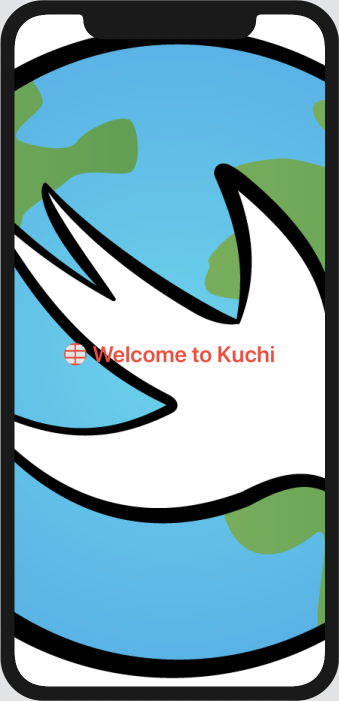
Welcome 이미지(image)는 괜찮아 보이지만 존재감(presence)과 색상(color)이 너무 과하다.
View와Image에는 이미지의 모양(appearance)을 조작(manipulate)할 수있는 포괄적인(comprehensive) 수정자(modifiers) 목록(list)이 있다. 여기에는 opacity, blur, contrast, brightness, hue, clipping, interpolation,aliasing이 포함(include)된다. 이러한 수정자(modifiers) 대부분은View프로토콜(protocol)에 정의(defined)되어 있으므로, 이미지(images)에만 국한(limited)되지 않고, 이론적(theoretically)으로는 어떤 뷰(view)에서든 사용할 수 있다.이 이미지(image)를 참조(reference)로 사용하여 각 수정자(modifier)가 수행하는 작업을 확인한다. 캔버스(canvas) 미리보기(preview)에서 빌드된(build up) 실시간 결과(live result)를 확인하려면, Xcode에서 한 번에 하나씩 수정자(modifiers)를 추가하는 것이 좋다:
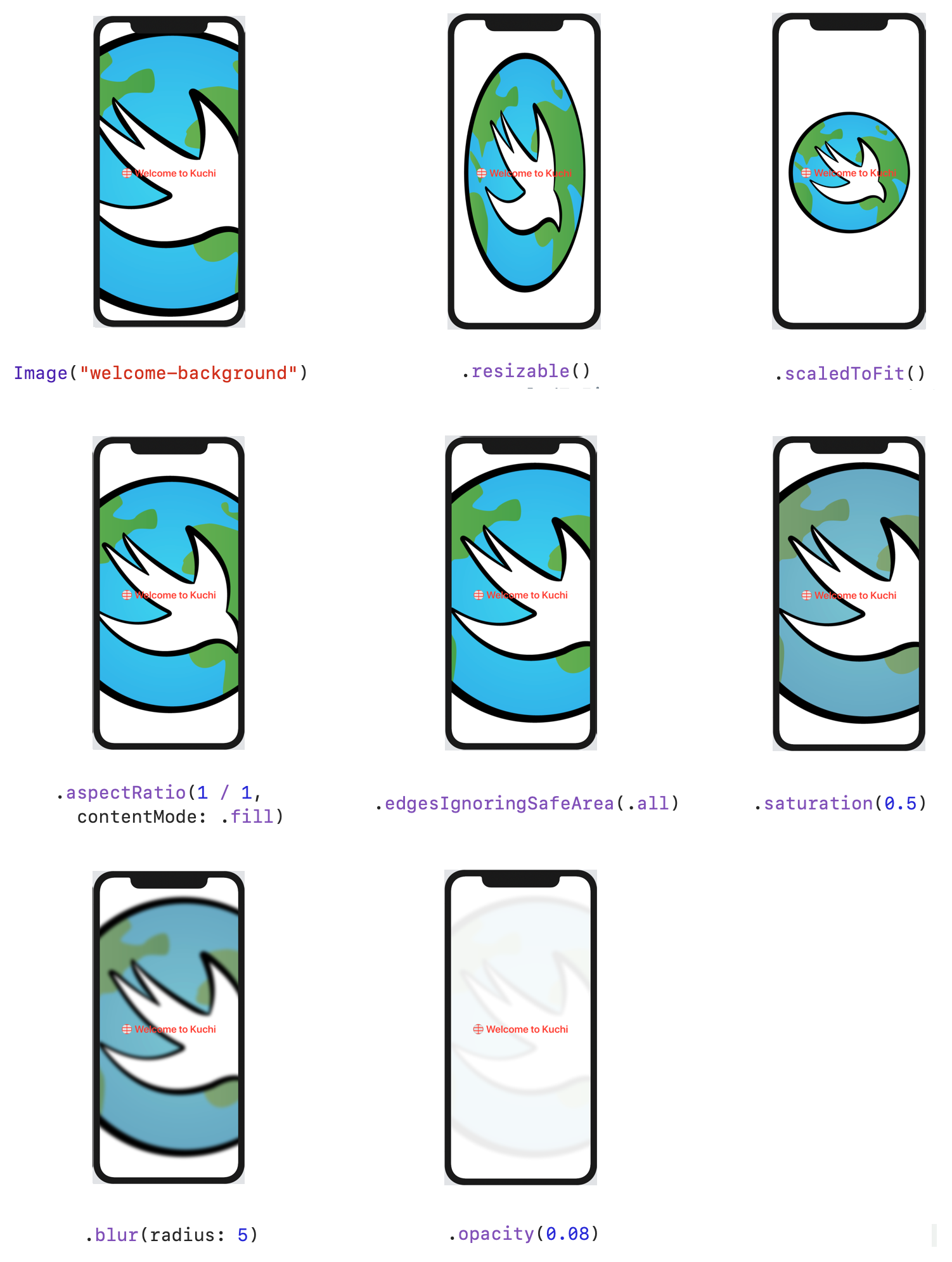
Background image modifiers 이미지(image)의 최종 코드는 다음과 같아야 한다:
Image("welcome-background", bundle: nil) //추가한 이미지
  .resizable()
  //크기를 조정한다. 기본적으로 SwiftUI는 가로 세로 비율에 대한 고려없이 모든 공간을 원하는 대로 사용하려한다.
  .scaledToFit()
  //원본 비율로 부모 뷰에서 완전히 표시되도록 이미지를 최대화한다.
  .aspectRatio(1 / 1, contentMode: .fill)
  //비율을 1:1로 설정한다. contentMode를 .fill로 설정하면 이미지가 전체 상위 뷰를 채우므로, 이미지의 일부가 view의 경계를 넘어 확장된다.
  .edgesIgnoringSafeArea(.all)
  //safe area의 insets을 무시하고, 전체 상위에서 공간을 차지하도록 한다.
  //여기에서는 모든 가장자리를 무시하지만, .top, .bottom, .leading, .trailing, .vertical .horizontal와 같이 무시할 가장자리를 배열로 전달할 수 있다.
  //.vertical은 두 개의 수직 가장자리, .horizontal는 두 개의 수평 가장자리를 결합한 것이다.
  .saturation(0.5)
  //이미지의 채도를 줄인다.
  .blur(radius: 5)
  //블러를 추가한다.
  .opacity(0.08)
  //불투명도를 설정한다. 덜 두드러지게 된다.
다시 한 번, 해당 뷰(view)에 중복되는(redundant) 수정자(modifier)가 있다.
세 번째 줄(line)인
.scaledToFit수정자(modifier)이다. 이미 이미지(image)를.resizable로 부모(parent)에 맞춘 다음.aspectRatio를 사용해 이미지(image)가 부모 뷰를 채우도록(fill) 한다..scaledToFit수정자(modifier)를 주석(comment) 처리해도, 최종 결과가 변경(change)되지 않는 것을 알 수 있다.scaledToFit과aspectRatio의 순서를 바꾼다면(switch), 어떻게 될지 짐작(guess)해 본다.scaledToFit은 이전(previous) 행(line)에서 설정(set)한 채우기(fill) 모드(mode)를 재정의(overrides)하므로, 중복(redundant) 수정자(modifier)가 된다. 그러나 가로 세로 비율(aspect ratio)을 2와 같이 변경한다면:.aspectRatio(2 / 1, contentMode: .fill)이 경우에는 높이(height)를 변경하지 않고(unaltered), 너비(width)를 두 배(twice)로 늘리기 때문에 결과는 상당히 달라진다(different).
Custom ratio 해당 가로 세로 비율(aspect radio) 변경(change)을 되돌리고(revert), 중복되는(redundant)
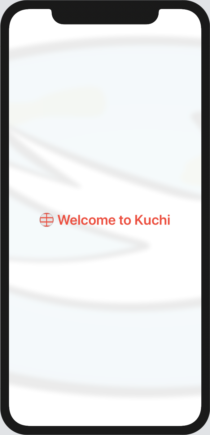
.scaledToFit를 안전하게(safely) 제거(delete)한다. 배경(background) 코드는 다음과 같아진다:Image("welcome-background", bundle: nil) .resizable() .aspectRatio(1 / 1, contentMode: .fill) .edgesIgnoringSafeArea(.all) .saturation(0.5) .blur(radius: 5) .opacity(0.08)Splitting Text
이제 배경 이미지(background image)의 모양(shape)이 좋아졌으므로, welcome 텍스트(text)가 더 멋지게(nicer) 보이도록 재작업(rework)해야 한다. 하나가 아닌 두 개의 텍스트(text) 뷰(views)를 사용하여, 두 줄(lines)을 채우(fill)도록 한다. 텍스트(text)는 세로로(vertically) 분할(split)되어야 하므로, 다음과 같이 welcome 텍스트(text) 주위에
VStack을 추가하기만 하면 된다:VStack { Text("Welcome to Kuchi") .font(.system(size: 30)) .bold() .foregroundColor(.red) .lineLimit(2) .multilineTextAlignment(.leading) }다음으로(next), 텍스트(text)를 두 개의 별도 뷰(views)로 분할(separate)할 수 있다:
VStack {
  Text("Welcome to")
    .font(.system(size: 30))
    .bold()
    .foregroundColor(.red)
    .lineLimit(2)
    .multilineTextAlignment(.leading)
  Text("Kuchi")
    .font(.system(size: 30))
    .bold()
    .foregroundColor(.red)
    .lineLimit(2)
    .multilineTextAlignment(.leading)
}
각
Text의 마지막 세 수정자(modifiers)가 동일(same)하다는 것을 알 수 있다(notice).View에서 구현된(implemented) 수정자(modifiers)이므로 각 개별(individual) 뷰(view)대신 상위 스택 뷰(stack view)에 적용하여 코드를 리팩터링(refactor)할 수 있다:VStack { Text("Welcome to") .font(.system(size: 30)) .bold() Text("Kuchi") .font(.system(size: 30)) .bold() } .foregroundColor(.red) .lineLimit(2) .multilineTextAlignment(.leading)이는 매우 강력한(powerful) 기능(feature)이다. 컨테이너 뷰(container view)가 있고 모든 하위 뷰(subviews)에 하나 이상의 수정자(modifiers)를 적용(applied to)하려면, 해당 수정자(modifiers)를 컨테이너(container)에 적용(apply)하기만 하면 된다.
Note: 포함된 각 뷰(each contained view)의 처음 두 수정자(modifiers)에 대해 동일한 작업을 수행하지 않은 이유가 궁금할 것이다.
.font와.bold에 대한 문서(documentation)를 살펴보면, 이는Text유형(type)에 대한 수정자(modifiers)임을 알 수 있다. 따라서 이러한 수정자(modifiers)는View와VStack에서 사용할 수 없다.두 줄(lines) 텍스트(text)의 글꼴 크기(font sizes)가 다르다면 더 좋을 것이다. welcome 텍스트(text)에서
.headline스타일(style)을 사용하여.font(.system(size:30))를 다음으로 바꾼다(replacing):.font(.headline)Kuchi 텍스트(text)의 경우,
.largeTitle을 대신 사용하고.font(.system(size:30))을 다음으로 바꾼다(replacing):.font(.largeTitle)마지막으로 컨테이너(container)의 스타일(style)을 지정하여 약간 비좁게(cramped) 만들 것이다. 이미지(image)와 텍스트(text) 사이에 약간의 패딩(padding)이 필요하다.
.padding수정자(modifier)를 사용하고.horizontal을 전달하면 양쪽에 수평(horizontally)으로 패딩(padding)이 추가(adds)된다. 독립적으로(standalone) 또는 가장자리(edges) 배열(array)로 top이나 leading과 같은 다른 가장자리(edges)를 번갈아(alternately) 전달(pass)할 수 있다. 또한 패딩(padding)에 대해 선택적(optional)으로 길이(length)를 지정할 수 있다. 이것을 지정(specify)하지 않으면, SwiftUI가 기본값(default)을 적용(apply)한다.전체(entire) 텍스트(text) 스택(stack)의 코드는 다음과 같아야 한다:
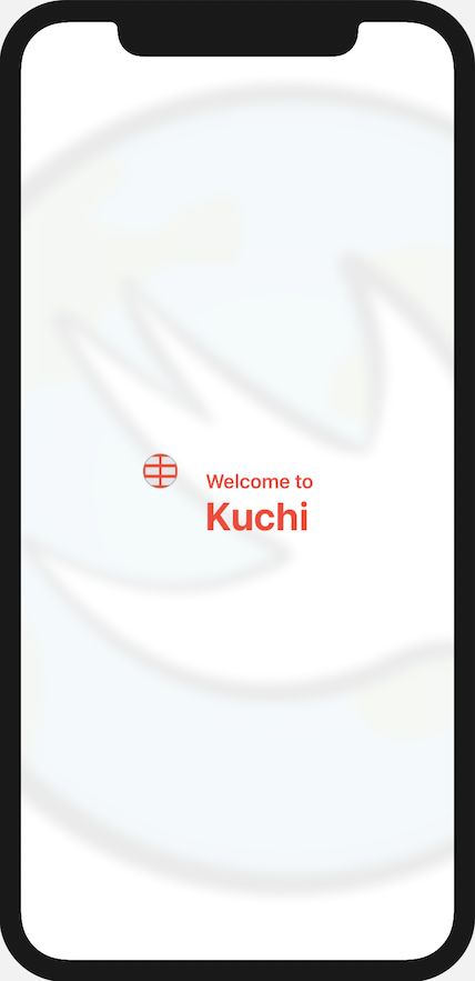
VStack(alignment: .leading) {
  Text("Welcome to")
    .font(.headline)
    .bold()
  Text("Kuchi")
    .font(.largeTitle)
    .bold()
}
.foregroundColor(.red)
.lineLimit(2)
.multilineTextAlignment(.leading)
.padding(.horizontal)
결과 뷰(view)는 다음과 같이 표시된다:
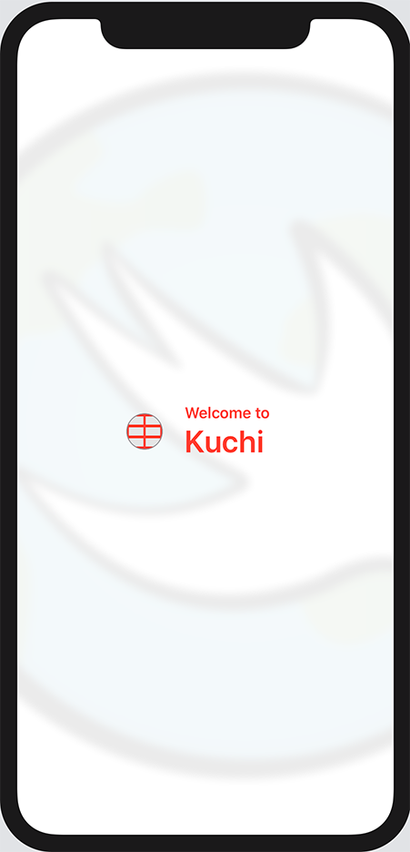
Welcome to Kuchi Accessibility with fonts
처음에는(initially) 텍스트(text)를 표시(display)하는 모든 뷰(views)에서
font(.system(size:30))수정자(modifier)를 사용하여 텍스트(text)를 렌더링(rendering)할 때 사용되는 글꼴(font)을 변경(changed)했다. 사용할 글꼴(font)과 크기(size)를 결정할 수 있지만, Apple은 가능한 한 절대 크기(absolute sizes)보다 크기 등급(size classes)을 사용할(favoring) 것을 권장(recommends)한다. 이것이 이전(previous) 섹션(section)에서.system(size:30)대신.headline및.largeTitle과 같은 스타일(styles)을 사용한 이유이다.모든 크기(sizes)는
Font에서 의사 열거형(pseudo-enum)의 사례(cases)로 정의(defined)된다. 실제로는(actually) 정적 속성(static properties)이다. UIKit 및 AppKit에는 해당(corresponding) 클래스(class) 크기(sizes)가 있으므로title,headline,body또는 이와 유사한 기타 속성(properties)에 대해 이미 알고 있을 것이다.크기 클래스(size classes)를 사용하면, 사용자가 참조 크기(reference size)를 기준으로 앱(app)에서 사용되는 모든 글꼴(fonts)을 자유롭게(freedom) 늘리거나(increase) 줄일(decrease) 수 있다. 참조 크기(reference size)를 늘리면(increased) 모든 글꼴(fonts)이 비례적으로(proportion) 커지고(larger), 줄이면(decreased) 글꼴(fonts)이 작아진다(smaller). 이는 시력(eyesight)에 문제(issues)가 있거나 시각(visual) 장애(impairments)가 있는 사람들에게 큰(huge) 도움(help)이 된다.
긴 여정(journey)이었다. 여기에 있는 개념(concepts)은 매우(pretty) 간단(simple)하지만, SwiftUI 개발(development)을 시작하기 위해 필요하다(necessary).
Label: Combining Image and Text
Image와Text는 자주(frequently) 사용된다. 이들을 결합(combining)하는 것은 매우 쉽다.HStack에 포함(embed)하기만 하면 된다. 그러나(however), 작업을 단순화(simplify)하기 위해 Apple은 해당 목적(purpose)을 위해 특별히(specifically) 새로운(brand new) 구성 요소(component)인Label을 제공한다.지금까지 수행한 작업으로 텍스트(text)와 이미지(image)가 포함된 뷰(view)가 생성되었으므로, 이 새로운 구성 요소(component)를 확인(test)할 차례이다.
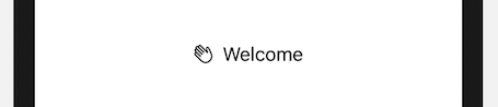
Label에는 원시 문자열(raw string)과 리소스 식별자(resource identifier) 또는 시스템 이미지 식별자(system image identifier)를 사용하는 몇 가지 생성자(initializers)가 있다. 예를 들어(for example), 손을 흔드는 아이콘(waving hand icon)과 함께 welcome 텍스트(text)를 표시(display)하려면 다음과 같은 코드를 작성(write)한다:Label("Welcome", systemImage: "hand.wave")다음과 같은 레이블(label)이 표시된다:
Label Example 또한 텍스트(text) 및 이미지(image)에 대한 사용자 정의(custom) 뷰(view)를 제공(provide)할 수도 있다. 텍스트(text)와 이미지(image)를 맞춤 설정(customize)하기 위해 이미 많은 노력을 기울여봤으므로(effort to), 이 방법을 따르는 것이 가장 적절한(appropriate) 선택이다.
이 생성자(initializer)는
title과icon이라는 두 가지 매개 변수(parameters)가 있으며 다음과 같다:init(title: () -> Title, icon: () -> Icon)실제 동작을 확인해 보려면, 다음 코드를 리팩터링(refactor)해야 한다:
HStack {
  Image(systemName: "table")
    .resizable()
    .frame(width: 30, height: 30)
    .overlay(Circle().stroke(Color.gray, lineWidth: 1))
    .background(Color(white: 0.9))
    .clipShape(Circle())
    .foregroundColor(.red)

  VStack(alignment: .leading) {
    Text("Welcome to")
      .font(.headline)
      .bold()
    Text("Kuchi")
      .font(.largeTitle)
      .bold()
  }
  .foregroundColor(.red)
  .lineLimit(2)
  .multilineTextAlignment(.leading)
  .padding(.horizontal)
}
따라서
Image는Label의icon매개 변수(parameter)로 이동하고, 수정자(modifiers)를 포함한VStack은title매개 변수(parameter)로 이동한다.위(above)의 코드를 다음과 같이 변경(change)한다:
Label {
  //HStack을 대신하여 Label로 리팩토링한다.
  //Label은 text와 image를 모두 가지고 있다.
  VStack(alignment: .leading) {
    //vertical stack에 포함된 두 개의 Text
    Text("Welcome to")
      .font(.headline)
      .bold()
    Text("Kuchi")
      .font(.largeTitle)
      .bold()
  }
  .foregroundColor(.red)
  .lineLimit(2)
  .multilineTextAlignment(.leading)
  .padding(.horizontal)
} icon: {
  //Swift 5.3의 다중 closures 구문을 사용한다.
  Image(systemName: "table")
    //Image 구성 요소
    .resizable()
    .frame(width: 30, height: 30)
    .overlay(Circle().stroke(Color.gray, lineWidth: 1))
    .background(Color(white: 0.9))
    .clipShape(Circle())
    .foregroundColor(.red)
}
그러나(however) 이 변경 사항(change)을 적용(applying)하면, 아이콘(icon)과 텍스트(text)가 세로(vertically)로 정렬(aligned)되지 않아 뷰가 보기 좋게 표시되지 않는다.
Refactored with label 이 문제를 해결(fix)하려면 레이블(label)이 구성 요소(components)를 정렬(arranges)하는 방식을 재정의(override)해야 한다.
Label에 스타일(style)을 적용(apply)할 수 있다. 문제(problem)는 사용 가능한 어떤 항목도 현재 필요에 맞지 않는다는 것이다:DefaultLabelStyle: 기본값(default value)으로, 스타일(style)을 전혀 지정(specifying)하지 않는다. 제목(title)과 아이콘(icon)이 모두 표시(displays)된다.IconOnlyLabelStyle: 제목(title)은 무시(ignoring)하고, 아이콘(icon)만 표시(displays)한다.TitleOnlyLabelStyle: 제목(title)만 표시(displays)하고, 아이콘(icon)을 숨긴다(hiding).적절(fits)한 것이 없는 경우, 직접 만들(build) 수 있다. 사용자 정의 스타일(custom style)을 생성하려면 다음의 한 가지 요구 사항(requirement)만 있는
LabelStyle프로토콜(protocol)을 채택(adopts)하는 구조체(struct)를 만들어야 한다:func makeBody(configuration: Self.Configuration) -> Self.BodySwift File 템플릿(template)을 사용하여 Welcome 그룹(group)에 새 파일(new file)을 추가하고, 이름을 HorizontallyAlignedLabelStyle.swift로 지정한다. iOS 및 macOS 대상(targets)을 모두 선택(select)해야 한다.
다음으로 스타일(style)에 대한 빈 뼈대(empty skeleton)를 만든다:
import SwiftUI struct HorizontallyAlignedLabelStyle: LabelStyle { func makeBody(configuration: Configuration) -> some View { return EmptyView() } }configuration매개 변수(parameter)에는Label생성자(initializer)에 전달된text와icon매개 변수(parameters)가 모두 포함(contains)되어 있다.HStack에 포함(embed)하기만 하면 된다:func makeBody(configuration: Configuration) -> some View { HStack { configuration.icon configuration.title } }이게 전부이다. 사용자 정의(custom style)을 만들었다. 적용(apply)하려면 WelcomeView.swift에서 이전에 추가한
Label에 수정자(modifier)를 추가해야 한다.WelcomeView에서Label하단(bottom)에 다음 수정자(modifer)를 추가한다:.labelStyle(HorizontallyAlignedLabelStyle())보다시피 수정자(modifier)의 이름은
labelStyle()이며, 앞에서 언급한 바와 같이LabelStyle프로토콜(protocol)을 준수(conforms)하는 유형(type)의 인스턴스(instance)를 사용한다.다음과 같이 보이게 된다.
Label with Custom Style Label이 없는 버전(version)과 비교하여, 어떠한 차이(difference)도 확인할 수 없다.
Key points
Text및Image뷰(views)를 사용하여, 각각(respectively) 텍스트(text)와 이미지(images)를 표시(display)하고 구성(configure)한다.- 텍스트(text)와 이미지(image)를 단일 구성 요소(component)로 결합(combine)하려는 경우
Label을 사용한다. - 수정자(modifiers)를 사용하여, 뷰(views)의 모양(appearance)을 변경(change)한다. 수정자(modifiers)를 조합(combination)하여 사용하면 매우 강력할 수 있지만, 수정자(modifiers)의 순서(order)를 유의해야 한다는 점을 명심해야 한다(be aware of).
VStack,HStack,ZStack과 같은 컨테이너 뷰(container views)를 사용하면, 다른 뷰(views)를 세로(vertically), 가로(horizontally) 또는 다른 뷰 위(top)에 그룹화(group)할 수 있다.
'Raywenderlich > SwiftUI by Tutorials' 카테고리의 다른 글
Chapter 7: Introducing Stacks & Containers (0) 2021.04.08 Chapter 6: Controls & User Input (0) 2021.04.07 Chapter 4: Testing & Debugging (0) 2021.04.05 Chapter 3: Diving Deeper Into SwiftUI (0) 2021.03.19 Chapter 2: Getting Started (0) 2021.03.17